A Quick Guide on Color Theory in Fashion and Garment Production
Time to read: 15.5 minutes
Clay Banks, Unsplash
Professionals who use color theory in fashion design have extensive interdisciplinary knowledge about arts, psychology, optical physics, and chemistry.
They translate consumer needs into items that not only offer protection from the elements but also tell a story about the wearer’s personality, beliefs, attitude, experience, and more.
And color plays a meaningful role in telling that story.
Whether you are just launching your career in apparel design or you want to deepen your understanding of the technical side of fashion, this quick guide will provide answers to many of your questions regarding how to apply color theory in fashion design.
Fundamentals of Color Theory in Fashion Design
First things first: color wheels.
They are used in many creative industries to make color combinations and schemes that generate a pleasing effect to the eye.
RYB Color Wheel, Free SVG
CMYK Color Model, Wikipedia
You can buy or even paint your own physical color wheels (like RYB and CMY) to help you make good color combinations.
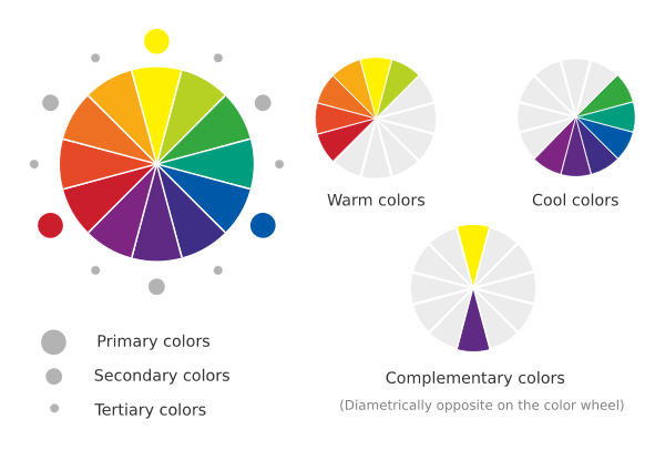
1. Types of Colors
→ Primary Colors
Primary means they can’t be obtained by mixing other colors.
There are three types of primary color wheels:
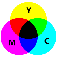
RYB color wheel (red, yellow, blue), which artists use when painting with actual paints (i.e. watercolors, acrylics, oil paints). When we combine all primary colors, we get the (achromatic) color black;
The RGB color system (red, green, blue) is used in digital designs only. When mixing the primary colors, they create pure white light;
The CMYK color model refers to the four ink plates in color printing: cyan, magenta, yellow, and key (black).
→ Secondary Colors
Secondary colors result from mixing two primary colors (orange is red plus yellow; green is blue plus yellow; purple is red plus blue).
Primary and secondary colors can also be referred to as hues.
→ Tertiary Colors
A tertiary color is made when you combine a secondary color with a primary color. In the RYB color wheel, red-orange, yellow-orange, yellow-green, blue-green, blue-violet, and red-violet are tertiary colors.
→ Complementary Colors
In fashion design, complementary colors are more than opposite base hues on the color wheel.
For example, neutral colors (beige, gray, cream, white, black), while not present on the color wheel, can complement the primary and secondary colors.
Neutrals can be classified into pure neutrals, near-neutrals, as well as warm and cool neutrals. Fashion and interior designers use them often due to their versatility and calming effect.

A capsule wardrobe generally consists of neutrals to enhance the more colorful garments. Thom Bradley, Unsplash
2. Color properties
→ Temperature
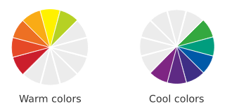
Half of the color wheel consists of warm colors, and the other half contains cool hues.
Color temperature can create various psychological effects on the viewer.
“A woman walking toward you in a red dress tells a very different story than the same woman in blue.”
→ Saturation and Value (or Luminance)
Saturation refers to the color intensity (or purity), while value describes its brightness
→ The Chroma Properties: Tint, Shade, Tone, and Mute
These are all ways to desaturate a color:
Tint - adding white to a base hue, resulting in a less intense color
Shade - adding black, creating a deeper color
Tone - adding grays to a color, resulting in various subtler versions of it
Mute - adding a complementary color to a base color
3. Color schemes

There are different ways of classifying color schemes. However, regarding color theory in fashion, these are the usual ones that help decide on the most harmonious color combinations:
Monochromatic
Analogous
Complementary
Triadic
Split-complementary
Tetradic
Trends in Fashion and Color. Where to Find The Right Information
Fashion is meant to be a dialogue between designers, consumers, and the media. Consumers have the final say on which vision is worth supporting at a given time, so trends cannot be fabricated and imposed on the masses.
When various companies attempted to manipulate public opinion (like “the hemline war” in the ‘70s), they ultimately lost a large portion of their revenue as well as the loyalty of their customers.
This proves how critical it is to choose your information sources wisely.
The “Color of the Year”
Color trends shift with the seasons and, on occasion, repeat throughout history.
The Pantone Color Institute announces the color of the year to characterize the “zeitgeist” or spirit of a given time. It has an impact not only on fashion but also on industrial and graphic design.
Fashion Forecasting
According to Blake Morgan, customer experience futurist, fashion is becoming more science-driven due to the impact of emerging technology on the industry. This means that algorithms, machine learning, and artificial intelligence (AI) tools are shaping the future of fashion.
To keep your competitive edge, fashion forecasting websites or consultants will provide you with insights into trends and consumer behavior that will help you shape your collection.
One of the most reliable sources (offering fee-based consultations) in that sense is WGSN, formerly known as Worth Global Style Network. There are also more accessible options; if you’re looking for a list of free trend forecasting sources, we’ve got you covered!
How to Create a Color Palette for Your Collection
In a fashion company, the textile print designer, raw material developer, or colorist is usually in charge of researching color trends — either independently or with forecasting companies — and presenting storyboards showcasing the chosen colors to the rest of the team.
Your Color To-Do List
Creating a color palette and applying it to production involves the following tasks:
Research color theory and trends in fashion;
Choose the color combinations for the collection;
Create color options using CAD tools or sketching by hand;
Match colors according to color standards;
Communicate the correct color references with your suppliers and your team, making sure they are using the same Pantone guide or another color standard;
Contact your supplier to create lab dips for you according to the chosen color palette and standard – keep in mind this process can take around two weeks to complete;
Check and approve lab dips.
The purpose is to obtain a functional sample according to your design vision. Based on that, you will then build your tech packs and finally start the manufacturing process.
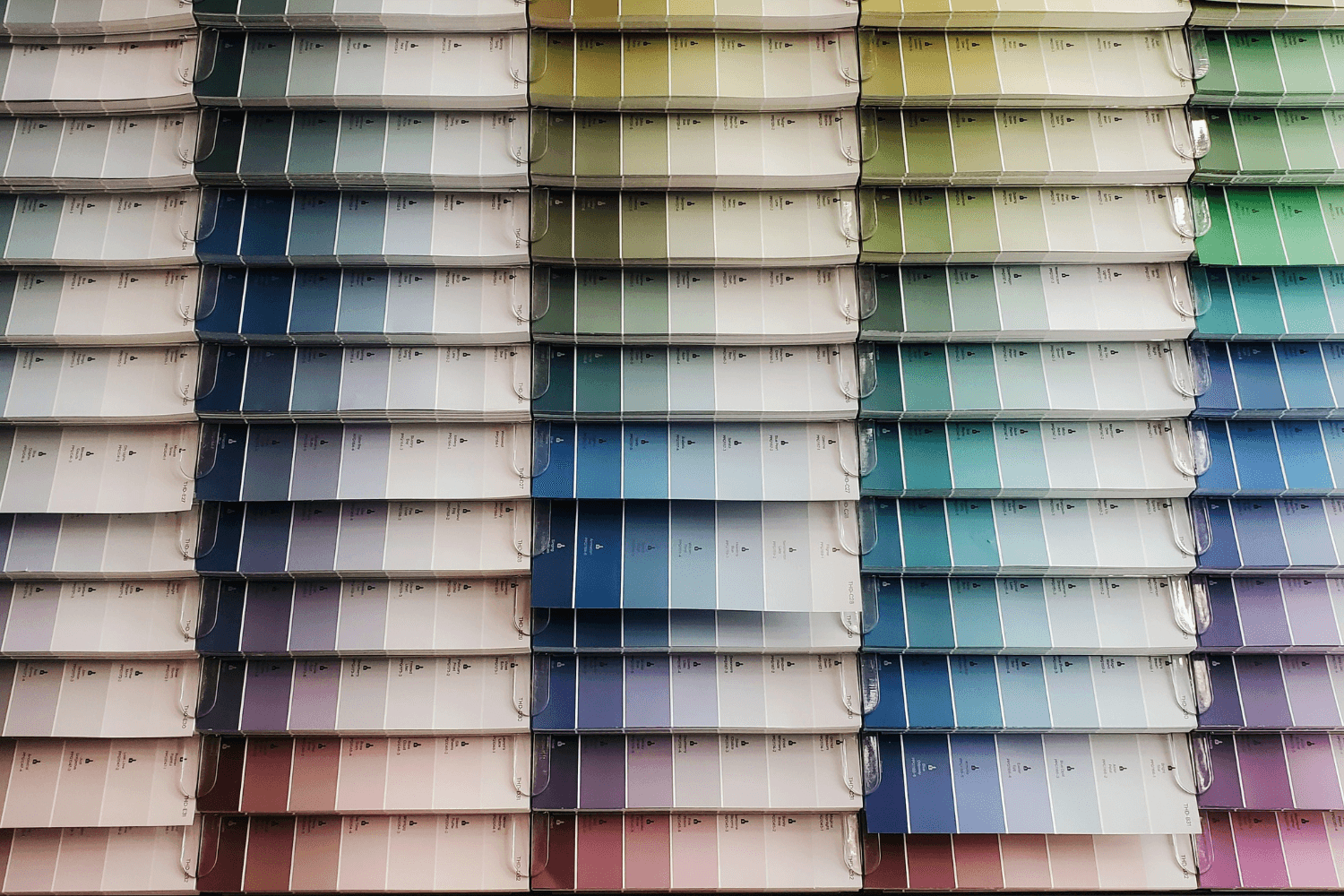
The Pantone Color System

Christina Rumpf, Unsplash
The Pantone color system is essential in clothing production due to the fact that designers and manufacturers need a common language, as well as a numbering system. You’ll mostly be communicating with your suppliers remotely, over email and video calls. Computer screens don’t show colors accurately, and every screen has its own manufacturer and user settings. So if you send your supplier an image of a color, once they open the image on their computer, they won’t necessarily be looking at the same color as you. For this reason, the Pantone system has become the industry standard in quantifying colors.
“A few of the most popular colors throughout history:
Shocking Pink (PANTONE 17-2127) – made famous by Marilyn Monroe in the 1950s when she wore a pink dress by costume designer William Travilla;
Mauve Shadows (PANTONE 16-3205) – invented and named in 1856 by the chemist William Perkin and gained popularity in the 1920s’ haute couture. It was also the world’s first synthetic dye;
Cloud Cream (PANTONE 12-0804) – used since the early 20th century as an alternative to stark white.”
There are two types of color guides most commonly used, catering to different industries and budgets. The one used in fashion is called “Fashion, Home + Interiors” and comes in a few different versions:
Fabric Swatch Books (TCX)
Paper Books (TPG and TPX)
The Textile Cotton Extended Range books (TCX) contain cotton swatches dyed in different Pantone colors. This version is great if you would like to see your colors on cotton fabric in particular. You can also get polyester and nylon color guides if you work with these fibers instead.
The Paper Versions are less expensive but still reliable. The difference between TPG and TPX is that the Textile Paper Green book (TPG) is more eco-friendly than the Textile Paper Extended Range one (TPX). You can get these in a mini fan deck version if you are on a budget, or splash out for the larger books with tear-off color chips if you need to share these with your team.
Whichever you choose for your design process, Pantone recommends replacing it every year in order to benefit from the color updates and to make sure you don’t use samples whose colors have faded over time. We don’t quite manage annual updates, but we make sure to keep the color books inside a closed cupboard or sealed box, to prevent extended exposure to light.
Tips for Using Lab Dips
“A lab dip is a mid-size swatch of fabric that has been dyed to match a specific color standard—usually Pantone.
Lab dips are reviewed by the designer, product developer or colorist, under controlled lighting conditions with the help of a light box or a spectrophotometer. If you’ve not yet invested in a light box, just use midday natural sunlight instead.”
Lab dips are an essential step in manufacturing because you should always see a sample before launching a full-size product. That way, you can prevent color errors in production.
Furthermore, analyzing various swatches can help you make better choices with regard to the color or fabric.
To get the most out of this stage, it’s important to agree on a color standard with your supplier — whether they rely on Pantone or another system of their own.
It is also a good idea to test the exact fabric that you will use in your collection. Colors look different on various mediums, so this is the only way to know if the finished product will match the lab dip.
Are You Ready to Pursue Your Design Vision?

Tech Pack Example, TECHPACKS.CO
We dipped into the fundamentals of color theory in fashion, color trends, and some of the work that goes into fashion design and manufacturing.
With this quick guide by your side, you should have a better idea of what to do next in your design process.
Do you need support in creating the technical sketches and documentation to bring your vision to life? Check out our templates and online workshops, or schedule a call with us to discuss your products; we can create tech packs for you in just 4 weeks. Send us a physical color reference in the mail so we can add the correct Pantone references for you to the tech packs. We’ll have you on the path to reliable color development in no time!


Author Bio
Tech Packs Co founder Belinda is a technical fashion designer from London, now based in Los Angeles. Belinda had her first job in fashion at the age of 15, fixing swatch cards together. Since then, Belinda has been designing & creating tech packs for more than a decade... for household name brands and independent designers alike.